
Brand Kit
Follow these guidelines when promoting Buburuza in marketing communications, including advertising, articles, websites, social media, and printed promotions.
download
Logo
The Buburuza logo features a striking black and white design that conveys a sense of seriousness and authority. The logomark, a bold and intimidating symbol, stands out prominently alongside the bank's name. It's essential to maintain the integrity of the name in all written materials, ensuring that 'Buburuza' is presented with the same level of gravitas as the logo itself.


Symbol
The Buburuza logo features a playful arrangement of dots that mimic the unique pattern of a ladybug's shell. This design not only captures the essence of the ladybug's appearance but also symbolizes our vibrant and innovative spirit. Each dot represents our commitment to creativity and attention to detail, making our brand instantly recognizable and memorable.
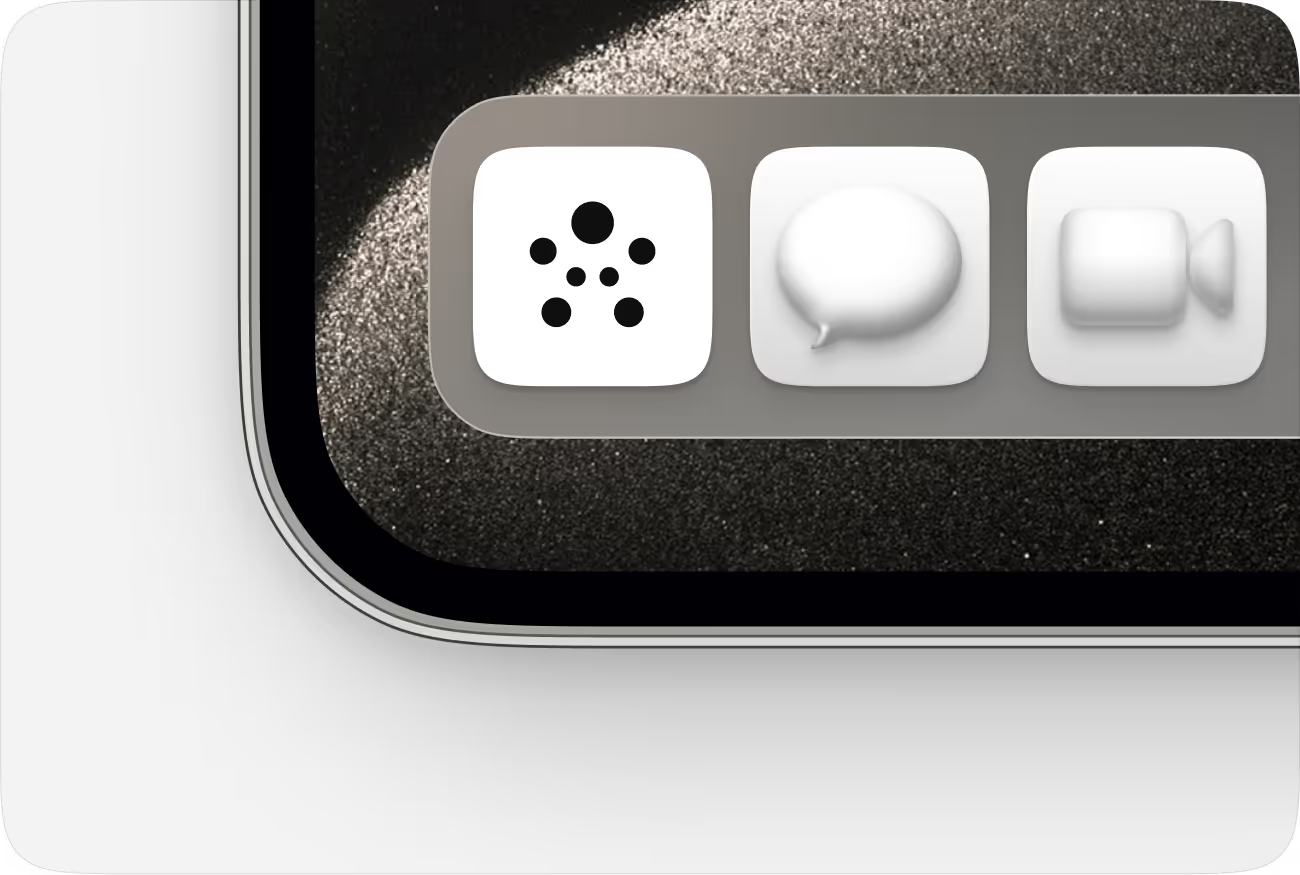
The logo symbol is used as an application icon.
Clear space
The Buburuza logo features a playful arrangement of dots that mimic the unique pattern of a ladybug's shell. This design not only captures the essence of the ladybug's appearance but also symbolizes our vibrant and innovative spirit. Each dot represents our commitment to creativity and attention to detail, making our brand instantly recognizable and memorable.
Don’t
- Do not use color combinations that impair the readability of the logo.
- Do not stylize the logo by adding shadows, outlines, or other effects.
- Do not alter the logo by stretching or distorting its proportions.
- Do not use different colors for the logomark and text.


Logos
Color system
Our main color palette features soft creamy whites, deep blacks, and vibrant red-pink gradients.
White is used as the main background color, creating an airy and clear feeling.
Black is the primary color for text and buttons.
We use these red-pink gradients to draw a parallel with the striking colors of the ladybug.
White is used as the main background color, creating an airy and clear feeling.
Black is the primary color for text and buttons.
We use these red-pink gradients to draw a parallel with the striking colors of the ladybug.


Leadership headshots
When referencing our leadership team, please use the following headshots and descriptions in your materials.

Daniel Zakharov
Founder & CEO

Oliver Kol
CTO, DPO, CISO

Dr. Grigoriy Bakalor
COO

Yeray Calle
CMO

Anthony Granberg
CPO

Kimon Gkomozias
CFO
HEADSHOTS
Type system
Our type system features two core typefaces — Neue Haas Grotesk Display Pro and IBM Plex Mono — used for headlines and body text.
Together, they create a balanced typographic structure that feels modern, precise, and consistent across all applications.
Neue Haas Grotesk Display Pro
Used for headlines, large titles, and key statements that define our tone. Available in three weights and applied consistently across layouts for clarity and visual balance.

IBM Plex Mono
Body and technical typeface. Used for data, code, and structured text blocks. Comes in three weights and is often used in all caps for clarity and consistency.

an Ai-Bank

